Contact us
—
1 Martlet Offices
Sussex County Cricket Club
Brighton & Hove
BN3 3AN
—
Historical product, contemporary brand
—
A Case Study
THE BRIEF
—
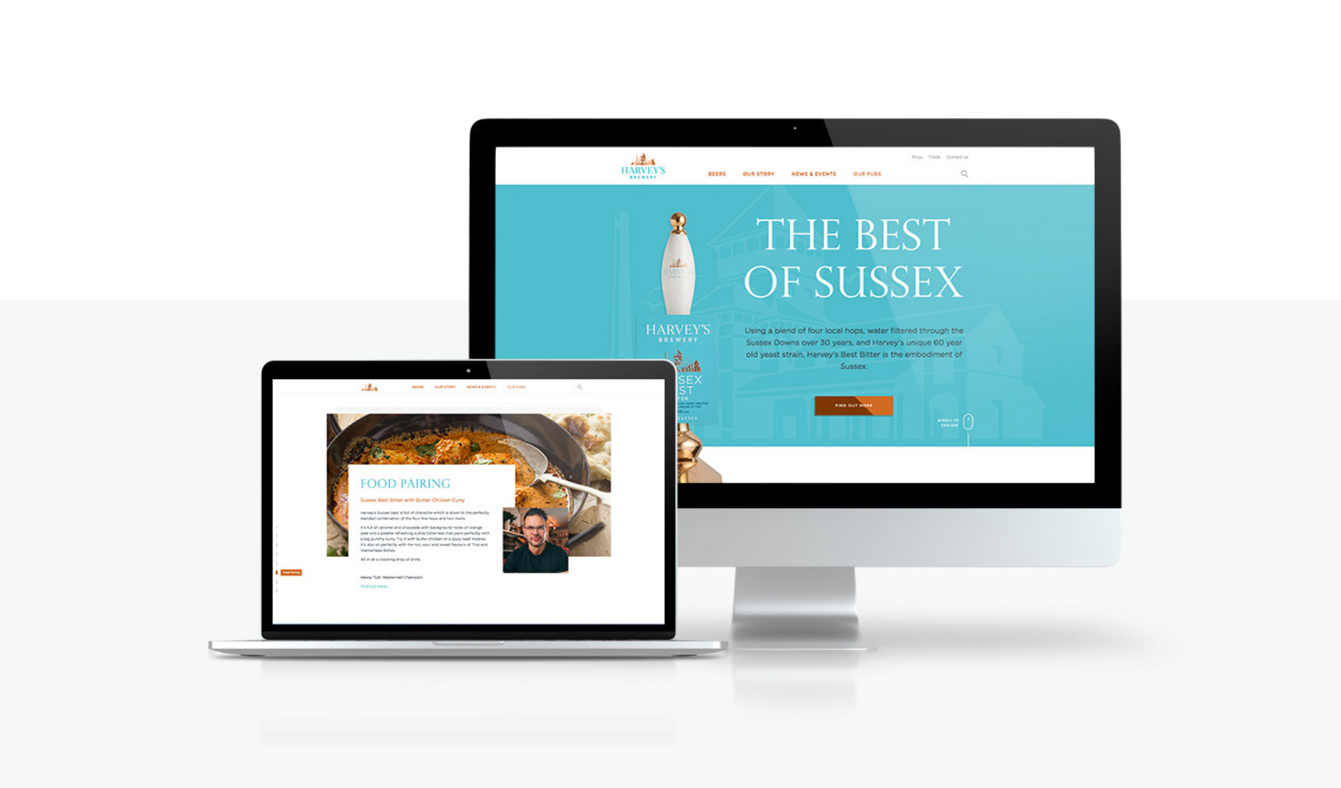
Design and develop an innovative and contemporary e-commerce site for Sussex based brand, Harvey’s Brewery.
—
After successfully winning a pitch and securing the project, Harvey’s Brewery tasked O&G with creating an exciting e-commerce website that reflected the refreshed and modernised branding that Harvey’s had introduced the previous year.
—
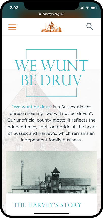
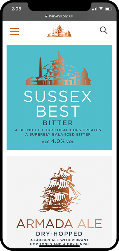
It was important that the new website design and functionality was not only updated and clean, but also still true to the history and heritage of the Harvey’s brand. Established over 225 years ago, Harvey’s Brewery are a Sussex institution and it was important that this was evident throughout the new site. Harvey’s also wanted to ensure that the website was informative and educational with regards to their carefully crafted brewing process and the variety of products that are available.
—
Creative concepts
Art direction
Design
Development
Project Management
—
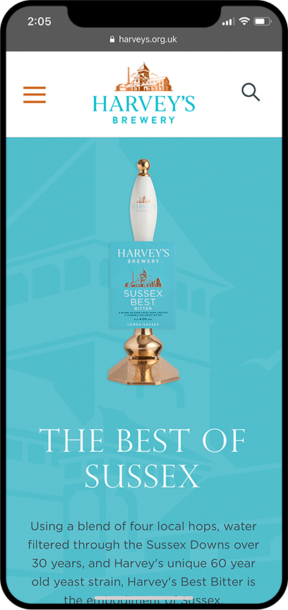
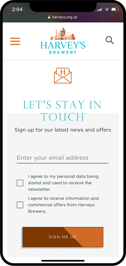
In order to ensure that the new bespoke site offered a much more user-friendly experience for visitors, it was essential that both the design and development elements of the project were entirely compatible with mobile. Whilst the site needed to look appealing from a visual perspective, the overall functionality and useability of the e-commerce site was equally as important.
—
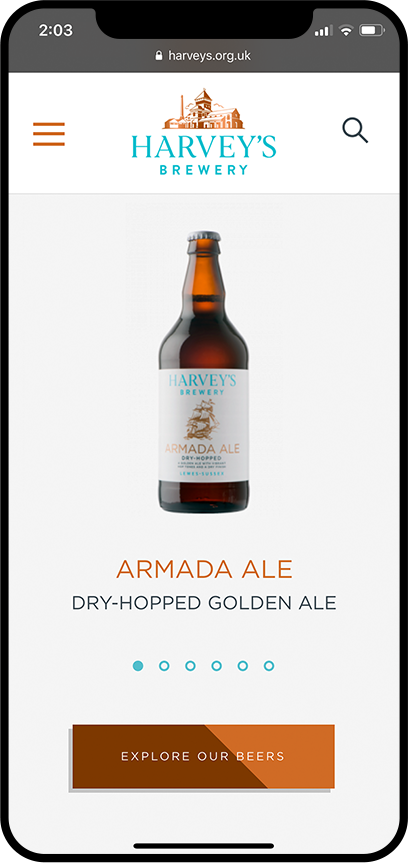
Using Harvey’s recently refreshed colour palette of teal and copper along with their new brand guidelines, we designed a visually stunning website with an overall contemporary aesthetic. Using swift animation, engaging photography and developing a suite of updated iconography, the final result from a visual perspective is something very unique and special to Harvey’s.
Iconography
—
THE RESULTS
—
+20%
Conversion—
Analytics have proven that since the launch, the new website has incurred +20% more product sales due to the functionality of the revamped online store and advanced brand experience.
+13%
Revenue—
Over the three months since launch, compared to the year prior, sales data has shown that revenue has increased by +13% as a direct result of the websites improved performance and ease. Harvey's audience can browse, explore and understand the products far better, with little effort involved.

+24%
Average session duration—
By understanding the habits and process behind what our audience requires out of a website, we have managed to design a website that is functional, informative, and a pleasure to explore; resulting in an improved user experience and longer sessions.
—
Try the website out for yourself:
https://www.harveys.org.uk
“Thank you for all of your efforts and hard work throughout the project and especially over the last few weeks — it’s been a pleasure working with you all. We’re very excited to see the new site live and kicking!”
—
MARKETING EXECUTIVE AT HARVEY’S BREWERY
LIKE WHAT YOU SEE?
—