Contact us
—
1 Martlet Offices
Sussex County Cricket Club
Brighton & Hove
BN3 3AN
—
A brand that really shouts ‘Brighton’
—
A Case Study
THE BRIEF
—

Create a distinctive new brand logo and visual identity for Brighton Half Marathon.
—
For over 30 years, Brighton Half Marathon has been encouraging runners to push themselves to new limits. When the charity behind it, The Sussex Beacon, came to O&G, they wanted us to push their brand to new limits too. You see, what started in 1990 as a spirited seaside run has evolved into one of the biggest events in the global marathon calendar. In fact, the Brighton Half Marathon now brings in crowds from all over the world, generating vital funds for other local charities in the process.
—
The organisers wanted an identity that was ‘grownup yet daring to be different’. We knew that the event was a reflection of Brighton itself — quirky, fun and community-focused. So we wanted to create a look that reflected the energy and uniqueness of our city, as well as its seaside heritage. We also needed to consider a flexible identity that enabled the client to easily produce marketing materials themselves, using their own imagery with the help of a small library of design elements inspired by the new brand. The challenge would be in achieving all of this.
—
Creative concepts
Art direction
Design
Development
Project Management
—
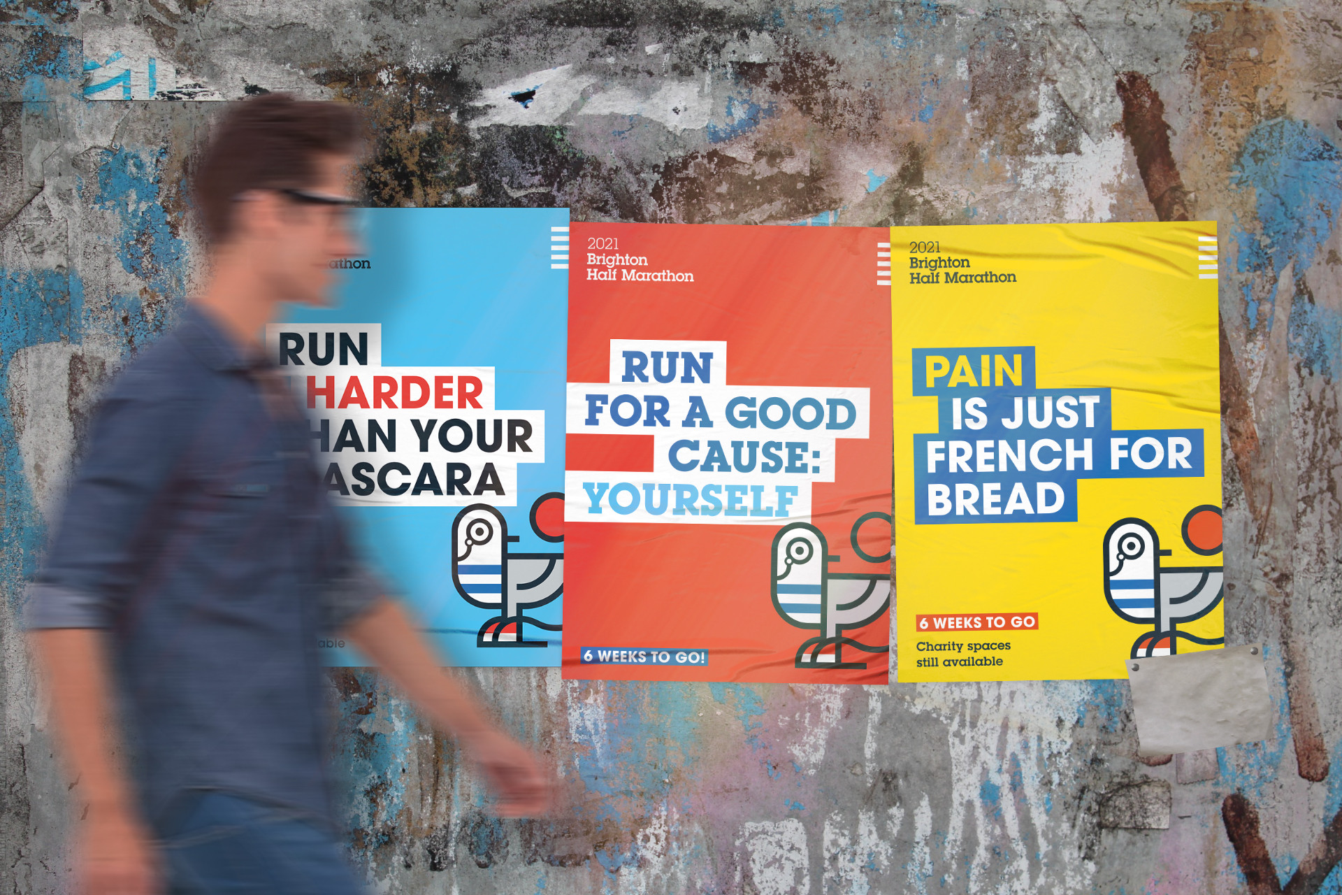
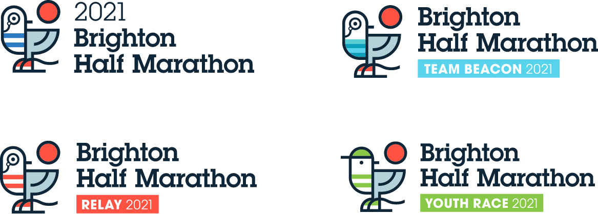
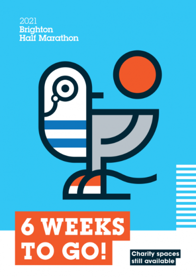
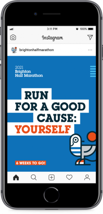
For starters, we decided that clichéd silhouettes of runners were officially out. Instead, we knew that every runner needed a friendly mascot to spur them on, one that captured the essence of the city. In other words, one that said ‘We Are Brighton’. And of course, you don’t get much more Brightonian than seagulls. And so ‘Beaky’ (from Sussex Beacon), the Brighton Half Marathon seagull was born.
—
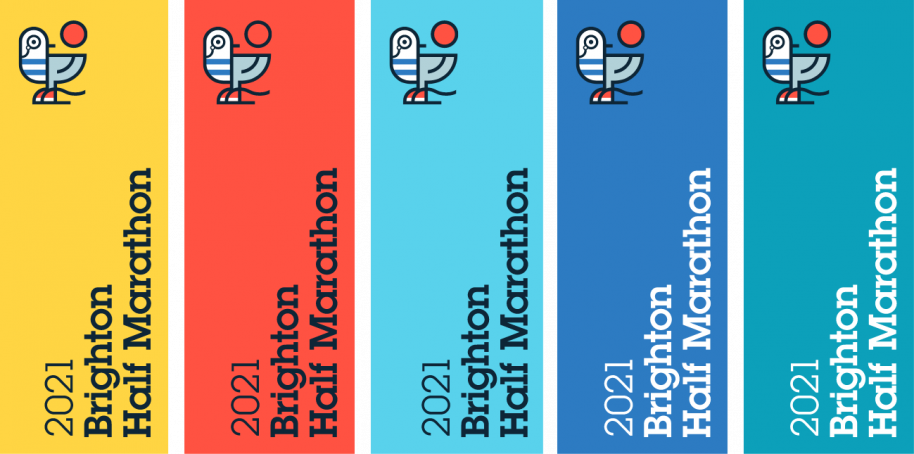
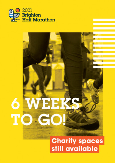
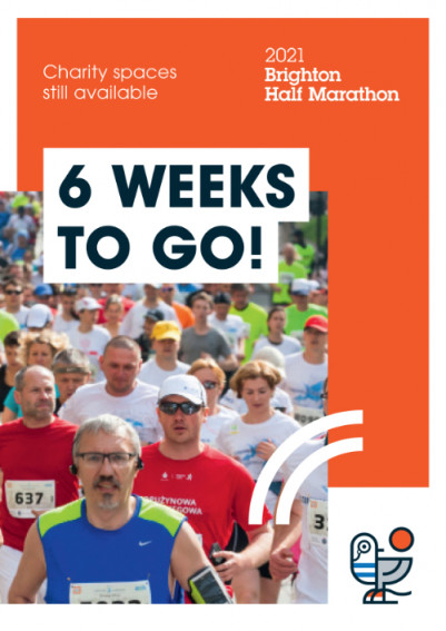
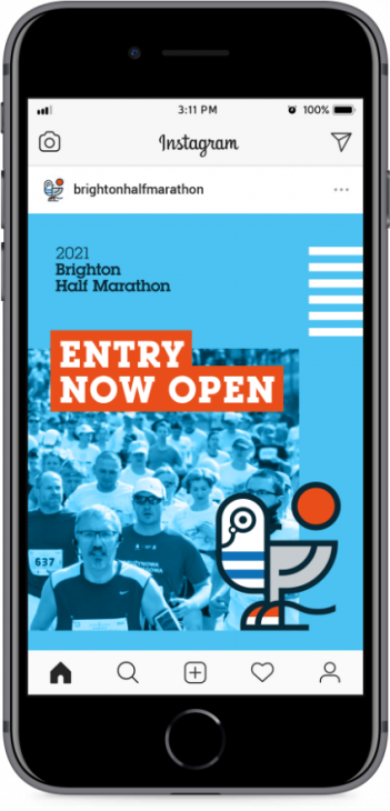
With ‘daring to be different’ in mind, we gave Beaky a tasteful monocle to turn him into an eccentric gentleman seagull — complete with running shoes and a striped shirt based on a 1920s bathing suit. Beaky is a little bit quirky, a little bit seaside vintage and, (like most local seagulls) very bold. In creating this logo — plus a striking new colour palette, typography and visual guidelines — we evolved the Brighton Half Marathon brand, making it much more memorable. And now the world’s most dapper seagull will feature in all of the marathon’s 2021 promotions, including billboards, advertising and social media.
“We are SO happy with this — your approach and creative flair has been faultless. We are so excited to let Beaky out of his cage! Well Done Everyone! ”
—
Marketing & Events Manager, The Sussex Beacon
LIKE WHAT YOU SEE?
—